What a flat-pack shelf can teach you about your brand message
Welcome to the Wordless Masterclass
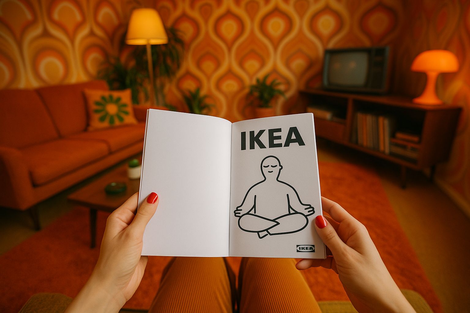
IKEA sells over 500 million meatballs a year—but their greatest export might be their instruction manuals. No words. No confusion (well, mostly). Just clever illustrations guiding millions from chaos to clarity—one hex key at a time.
So what can marketers learn from this Swedish wizardry of wordless communication? Turns out: a lot.
- Strip It Down to Essentials
IKEA doesn’t waste time explaining the philosophy of Allen keys. Their instructions show exactly what you need to do—and nothing else. That’s how your marketing should be.
Instead of: “Our platform enables cross-functional collaboration for enterprise scalability.”
Try: “Your team. One tool. Everything clicks.”
- Think Visual First
IKEA’s manuals prove that visuals are not decoration—they’re direction. In marketing, this means fewer abstract stock photos and more step-by-step visual storytelling. Don’t just say it. Diagram it. Animate it. Show the outcome before the pitch.
- Predict Confusion
What does IKEA do beautifully? They anticipate the mistake you’re about to make. Their instructions often include little “don’t do this” symbols. You can apply this to CTAs, onboarding flows, and customer journeys by proactively answering unasked questions.
- Universal Language Wins
IKEA communicates globally without translation. That’s only possible because they focus on clarity over cleverness. As a marketer, you should aim for the same. If your copy needs an explanation, it needs a rewrite.
Case in Point: Your Home Page = Your Manual
Your homepage is someone’s first attempt to “assemble” your product or brand. Is it guiding them clearly? Is it full of unnecessary jargon screws and misaligned value props?
Like IKEA, your message should be intuitive, scannable, and made to be used—not admired.
🧠 Final Takeaway
The next time you assemble a KALLAX, notice how little frustration comes from a lack of words—and how much comes from assuming the instructions aren’t worth reading. In marketing, people do the same with your content.
Make it visual. Make it simple. Make it worth reading.
Sources
IKEA Communications
https://about.ikea.com/en/about-us/ikea-highlights/ikea-instructions
Fast Company: What IKEA Instructions Teach Us About UX
https://www.fastcompany.com/90362059/what-ikea-instructions-teach-us-about-good-ux
Smashing Magazine: Visual Design Principles
https://www.smashingmagazine.com/2018/06/visual-design-principles/