Beyond Words: Why Nonverbal Communication Still Rules the Digital Realm
When we hear “nonverbal communication,” we often think of body language, eye contact, or the way someone leans into a conversation. But what happens when there’s no face, no voice, no gestures—only screens, fonts, buttons, and color palettes?
In the digital marketing world, where face-to-face interactions have been replaced by pixels and pings, nonverbal communication hasn’t disappeared. It’s evolved. Every layout choice, emoji, animation, hover state, or email timing sends a message—even when no words are used.
And here’s the twist: these subtle cues often influence how customers feel about your brand more than your actual copy.
In this deep dive, we’ll explore how nonverbal communication functions in digital marketing—how it’s designed, interpreted, and optimized—and why mastering this invisible language is one of the most overlooked levers in brand-building today.
The Psychology of Digital Body Language
In physical spaces, humans unconsciously read thousands of nonverbal cues: posture, pacing, micro-expressions. Online, we adapt by interpreting digital body language.
This includes things like:
- How fast a site loads
- The spacing and hierarchy of a page
- Button size, color, and placement
- Animation speed and visual feedback
- Response time to messages or emails
These are not neutral. A delay in response implies disinterest. A cluttered site layout feels like a lack of care. An inconsistent brand voice across channels creates friction.
Digital marketers must realize: we are communicating all the time, even when we’re saying nothing.
This is why leading brands obsess over user experience, visual rhythm, and interface microcopy—not because of aesthetics, but because they’re fluent in this silent language.
Design as a Nonverbal Language
Design is not decoration. It is meaning.
Typography, whitespace, color, imagery—all of these are the new “facial expressions” of your digital brand. They either reinforce your message or contradict it.
Let’s break down key design components that act as nonverbal signals:
1. Typography
Serif fonts suggest tradition and authority. Sans-serif fonts often signal modernity and approachability. A bold all-caps CTA feels different than a lowercase invitation.
Typography hierarchy also matters. Headlines that shout may excite—or exhaust. Overuse of italics and weight can feel aggressive. Subtlety, like in face-to-face tone, often conveys confidence.
2. Color
Color is emotion in digital form.
- Blue = trust and calm
Logo of Slack with bright colors on a lavender background
- Red = urgency or alert
- Green = growth, positivity
- Yellow = optimism (but overused, it signals cheapness)
When Slack launched, their calming lavender + teal palette felt like a subtle rebellion against stiff corporate software. It looked like a place you could work, and feel like a human.
3. Layout and Whitespace
Whitespace isn’t “empty space”—it’s breathing room. It signals clarity, focus, confidence.
Think of Apple’s product pages. Sparse. Minimal. It’s not that they couldn’t say more—they’re showing restraint, which conveys control.
Compare that to cluttered SaaS landing pages that drown in features and testimonials. The message there? “We’re insecure. Please don’t leave.”
4. Visual Feedback and Microinteractions
Every hover effect, loading spinner, form error animation—it all communicates.
When a button gently pulses instead of flashing, it says: “We’re thoughtful.”
When a checkout form wobbles if you miss a field? It says: “You’re not being careful.”
These microinteractions are your brand’s tone of voice in motion.
Nonverbal Communication in Email Marketing
We often think of email as purely verbal. But even here, nonverbal cues shape performance:
- Timing: An email sent at 11:59pm can feel intrusive or irrelevant, while one arriving at 9:01am may signal intention and rhythm.
- Sender name: “From: Customer Support” feels colder than “From: Jen at Brightly.”
- Line spacing and structure: Dense paragraphs feel overwhelming. Line breaks add air and feel like a dialogue, not a monologue.
- Design and device adaptation: Does it look good on mobile? That’s a silent signal of your attention to user experience.
The most successful emails feel personal—even when automated—because they’re written and designed to feel like someone is listening, not shouting.
UX and UI as Communication Strategy
User experience (UX) and interface design (UI) are not simply tech tasks. They are communication design.
In UX, the question is not: “How do we reduce clicks?”
The question is: “How do we reduce confusion?”
Consider the following scenarios:
- A pricing page that uses calm blue tones and clear toggles for monthly/annual plans signals fairness and transparency.
- A 404 page with a funny illustration and “Let’s get you back on track” message makes an error feel forgivable, even delightful.
- A checkout flow that breaks into digestible steps and progress indicators says: “We know this can be stressful. Here’s how we’ll help.”
In all of these, the brand is speaking without words. And users are listening with their gut.
The Power of Visual Storytelling
Humans are visual-first creatures. Our brains process images 60,000 times faster than text. That’s why infographics, motion graphics, and brand visuals are more than accessories—they’re front-line communicators.
Great visual storytelling conveys:
- Emotion (facial expressions, color, energy)

The unique brand design of Mailchimp
- Process (step-by-step sequences, visual metaphors)
- Brand values (diversity, inclusion, modernity, or tradition)
Illustrations, for example, are often chosen over photography because they’re more flexible in tone and more inclusive in character.
Look at how Mailchimp uses quirky illustrations with asymmetrical shapes and soft colors. It says: “We’re creative. We don’t take ourselves too seriously.” Without saying a word.
Emojis, Memes, and the Language of Internet Culture
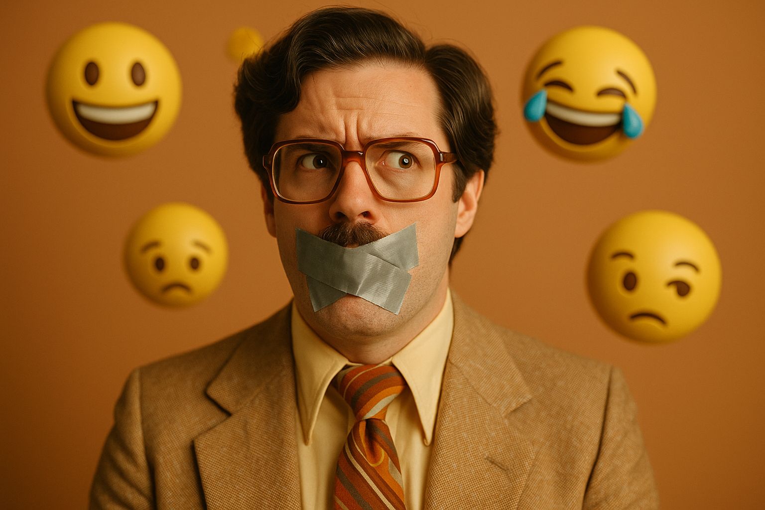
Yes, even 🤔 counts.
Emojis have become a shorthand for tone, emotion, and subtext—especially in SMS, email, and social media. They can soften a request, add playfulness, or emphasize a point.
But there’s nuance.
- Use too many: you seem unprofessional
- Use none: you might seem robotic
- Use the wrong one: you might seem tone-deaf (💀 for “funny” can mean different things across audiences)
The same goes for memes and GIFs. When used wisely, they show cultural fluency. When misused, they can make a brand feel outdated or pandering.
Professional brands can still use humor. The secret? Stay on-brand. Stay relevant. Don’t try too hard.
Trust Signals: The Most Powerful Nonverbal Cue
All of the above elements work together to communicate one thing: trust.
We often think of trust as something earned over time. And it is. But digital trust is also built in seconds through:
- Secure-looking UI and SSL indicators
- Legible fonts and clear spacing
- Responsive design
- Polished brand visuals
- Frictionless navigation
According to a Stanford study, 75% of users judge a company’s credibility based on their website design alone.
That means your layout, typography, and button shapes are doing more persuasion than your copy. Invest accordingly.
Conclusion: Speak Loudly with Silence
In a noisy world, the most powerful brands don’t just speak—they design, gesture, animate, and signal.
Mastering nonverbal communication in digital marketing isn’t about adding more noise—it’s about aligning the unspoken with the spoken. It’s about ensuring that every color, cursor, and scroll tells the same story your tagline does.
Because in the end, your audience isn’t just reading your message.
They’re feeling it.
Sources
Stanford Web Credibility Research
https://credibility.stanford.edu
Nielsen Norman Group – Visual Hierarchy
https://www.nngroup.com/articles/visual-hierarchy/
Mailchimp Brand Style Guide
https://mailchimp.com/about/brand/
IDEO – Emotional Design in UX
https://www.ideo.com/blog/the-emotion-in-design
Smashing Magazine – Microinteractions
https://www.smashingmagazine.com/2019/01/microinteractions-design-ux/